The best apps perform complex tasks with a simple interface. But when it comes down to it, it’s not about the technology…
If there is one thing we know about creativity, is that it takes courage to be creative.
As Ken Robinson said:
“If you are not prepared to be wrong, you will never come up with anything original.”
Being creative involves taking chances, exploring something new, risking that something may (or may not) work. By definition, this means there is always the possibility of looking a bit daft or foolish in front of others. And in today’s technological climate, sometimes it is a global audience which bears witness to your failings.
Turning to technology
It is not surprising then that people look to technology in order to make their ideas and propositions look as professional and polished as possible. This could be an architect needing to put together a presentation or a young child wanting to make a digital book.
Software developers often highlight how their apps offer a straightforward solution to a complex problem and with a few simple taps and selections, the task can be accomplished.
The inference almost being that the app will solve the problem, not the person.
Whilst few would disagree that an app can enhance the production of content in many ways, it falls short of being the creative agent. I work in a range of schools with people of all ages, abilities and across all curriculum areas. Despite this diverse landscape of learning, I use relatively few apps in all these different settings.
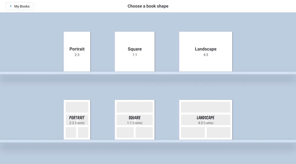
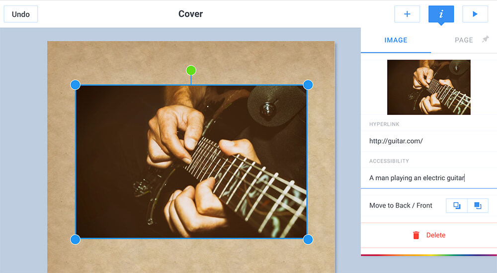
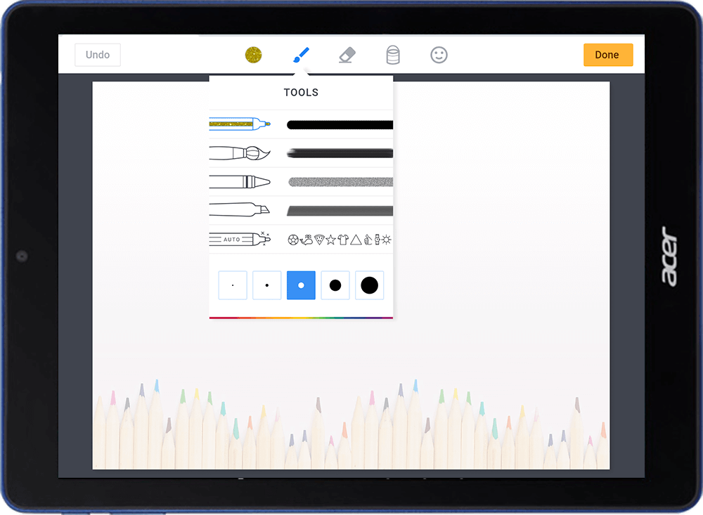
A constant in this ever changing work schedule is Book Creator. One of the reasons for this is that it presents learners with a simple choice of three page formats (portrait, square or landscape) and then a blank canvas when opened.
Avoiding uniformity
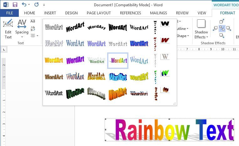
The issue I have with the latter approaches to content creation is that they are a step along the road towards ‘painting by numbers’. They edge the learner towards a fixed range of choices and ultimately, a degree of uniformity. Witness the ubiquitous use of the WordArt rainbow falling shadow in so many banners and posters on classroom walls.
Stephen Fry once said that “technology is like a mirror”, meaning that the output reflects the input of the user. (Some anecdotal evidence to support this is the difference in output between myself and David Hockney when we both use the Brushes app!).
In schools, the work produced by learners needs to be a reflection of their ideas, effort, creativity, imagination, focus and hard work. In order to maintain the ‘mirror’ effect of technology, it is important that software does not channel creative ideas towards convergence via built-in directive frameworks.
These frameworks, if too pervasive, can shape the content created to the point where the output begins to reflect the app and its design, rather than the individual user’s imagination. Apps like Book Creator, with its ‘blank page’ approach, are powerful because when used in a learning context, they help to reveal the differences between learners and accentuate individuality within a classroom of 30 children or students.
Striking the right balance
When developers are creating an app for use within the classroom, they are often striving to strike a balance between a number of polarities – see model below where the vertical axis represents the app’s interface and the horizontal axis represents the task.
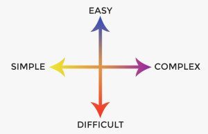
The best apps manage to perform ‘complex’ tasks with a relatively ‘easy’ to use interface, i.e. they are located within the upper right quadrant of the model. They are easy to use yet allow learners to create sophisticated pieces of work with the complexity hidden behind the interface.
Given that iOS apps exist within a culture of perpetual improvements and updates, the temptation is to either add more and more features which clutter the interface, or offer a range of preset options which short circuit the creative process in favour of task completion.
Both of which begin to position the app away from the desired location on the model. Consequently, these steps can hinder creativity as the former can mean spending too much time learning how to use the app, whilst the latter reduces the creative input to a simple selection process.
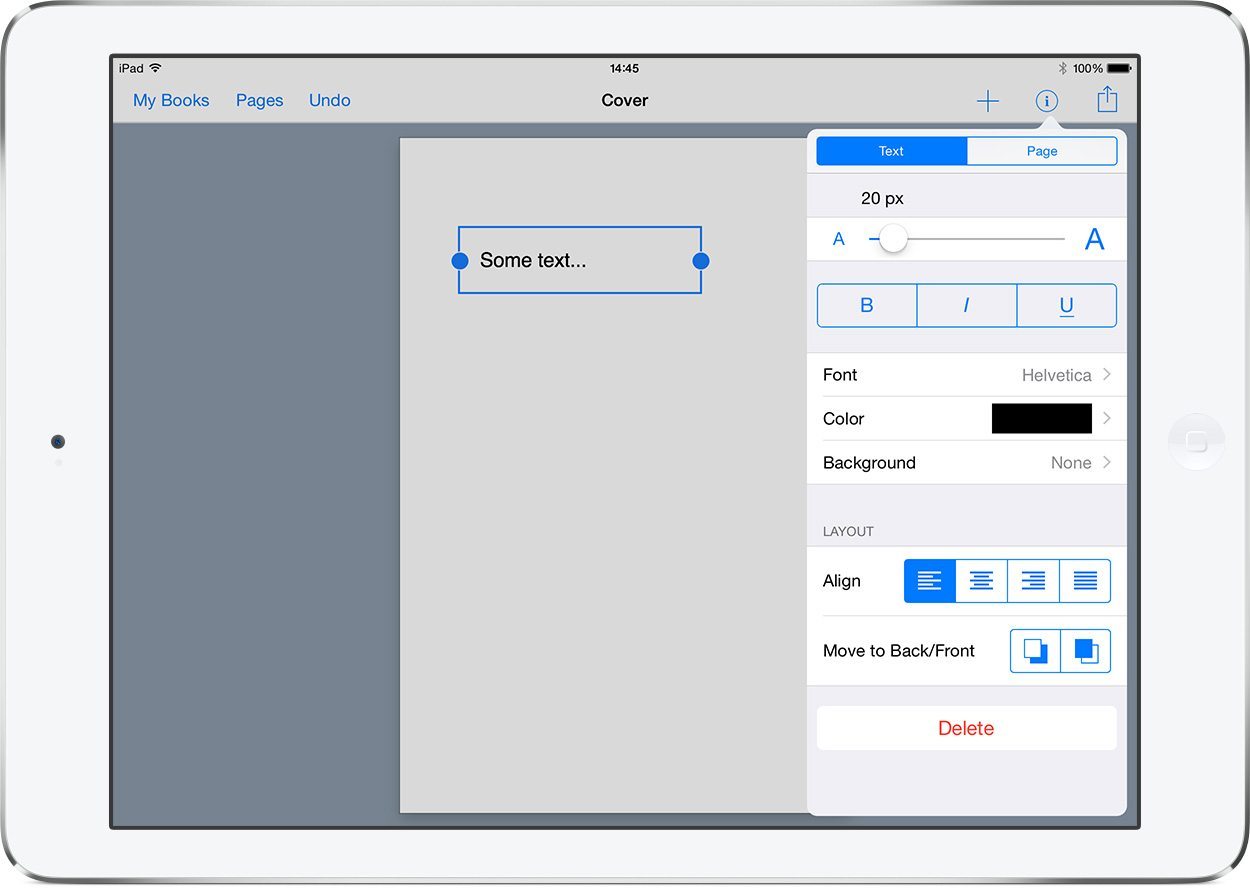
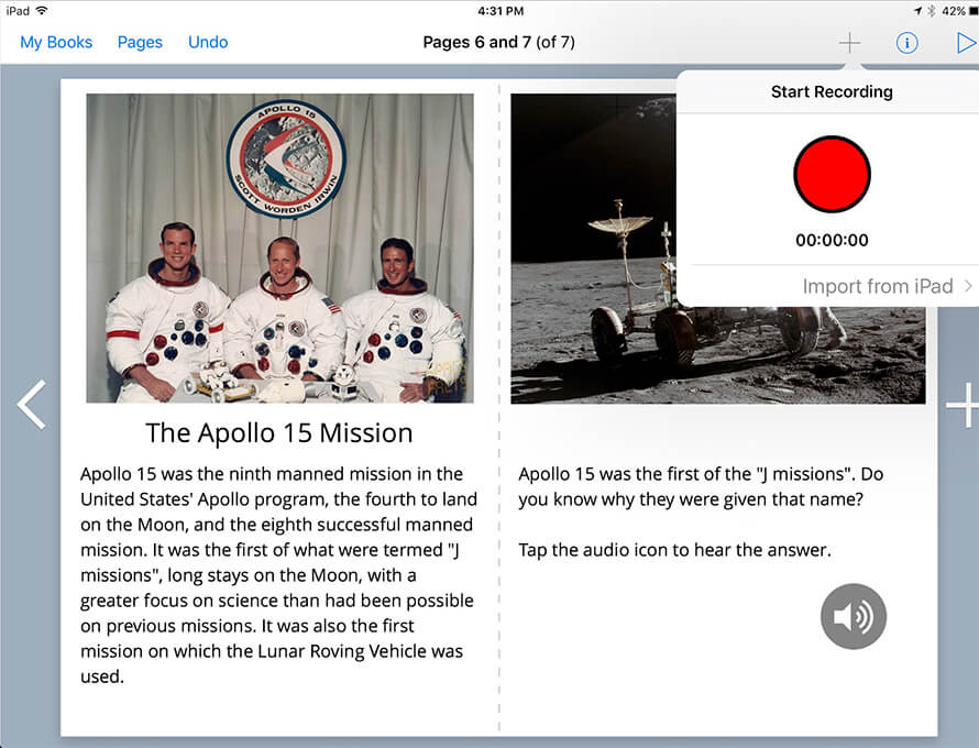
Book Creator has achieved this important balance by providing the simplest of interfaces which can produce rich and immersive interactive books, without resorting to restrictive guides and templates with convergent outputs.
A concern is how to maintain this equilibrium whilst staying ahead of the competition and keeping the app fresh and progressive.
My personal preference would be to enhance functionality with the ability to add gradients, textures, shapes, simple tables, frames/borders, shadows, reflections and so forth. These are useful building blocks for learners which with the right interface, can allow them to be even more creative with their ‘blank canvas’.
What do you think?
Ian Wilson has been working as a freelance Digital Creativity Consultant and Apple Education Trainer in UK schools for the past 12 years.
He currently manages the Cheshire Apple Regional Training Centre and spends his time in schools investigating methods and techniques for developing engaging and exciting ways to use Apple technology for learning and teaching.
Ian is a Book Creator Ambassador.




6 Comments on “The importance of the blank canvas”
Great post, Ian. Did you make up that quadrant or is it sourced from somewhere else? I am giving a presentation at the upcoming ECIS Technology conference in Munich and this is the topic I am speaking on: how we have to focus on the learning and must use technology that supports and facilitates learning rather than directs or squishes it into a packaged resource. I agree with your use of Book Creator across a divergent range of students/users. It is fast becoming my favorite app to use as a Learning Technology teacher for its ease of use, flexibility, and ability to integrate with other apps.
Hi Sonya, I devised the quadrant myself. I have been working on it for a little while now and this is the final version. Good luck with your presentation. Ian
Its something we always highlight isn’t Ian. Keep it simple and teachers will become comfortable in its look and feel and ultimately they will use it. Make it tech and interface heavy and they won’t use it and we have seen this for many years in education and business. CRM systems are a great example. They are huge pieces of software that can deliver 100’s if not 1000’s of outcomes but you find generally staff are only using one or two of those outcomes. VLE’s are another great example of this. I see apps such as Foldr and Showbie adding more and more features and I always want to shout ‘Nooooooo – don’t do it’ ! Keep it simple and again you will see the fruits of your labour and this is where Book Creator have been so successful and where maybe others such as Creative Book Builder haven’t. And the end result ? We all use Book Creator ! Great article from a great man – well done Mr Wilson :-)
Thanks for your comments Neil.
I’ve been using Book Creator in the classroom ever since my iPad 2. I really appreciate that they listen to suggestions and are always improving on the experience!
That’s a very important point Jack and one of the many ways the iPad (via the App Store) has changed the technology landscape in schools. Prior to the emergence of developers like Red Jumper, the vast majority of software schools used was provided by large companies like Adobe, Microsoft, Macromedia, etc. The chances of emailing one of these monolithic institutions and getting a relevant personal reply was zero. That has now changed and many app developers are happy to engage in a dialogue with their customers over future development of their software – which is great!