By taking the time to consider the variability of readers from the start, you can ensure your books work for more of your potential audience.

1. Choose text size and fonts wisely
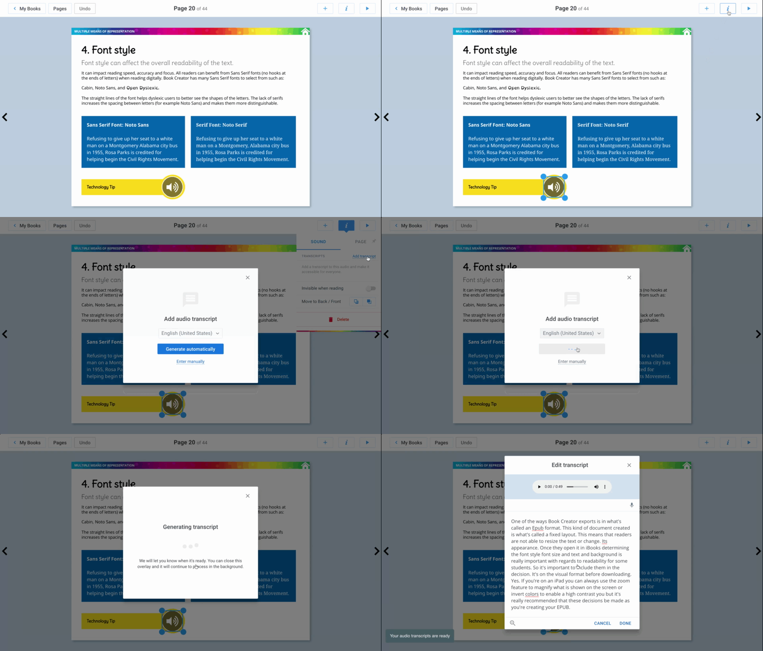
While Book Creator exports to the industry standard ePub format, the kind of ePub document it creates is of the fixed layout variety.
This means that readers are not able to resize the text or change its appearance when they open the book in iBooks (yes they can use the Zoom feature to magnify what is shown on the screen and Invert Colors to enable a high contrast view, but not everyone is familiar with these iOS accessibility features).
At a minimum, I would recommend a text size of 24px as a good starting point to ensure the text is large enough to be easily read without too much effort.
When comes to the processing of the text, some readers may have dyslexia or other reading difficulties. While there are special fonts for dyslexic readers that can be installed on the iPad, there is limited research on their impact on reading speed and comprehension.
Instead, the consensus appears to be that clean, sans-serifs fonts, which are good for all readers, can also help readers who have dyslexia. In Book Creator, you can choose from a number of sans-serif fonts such as Cabin, Lato and Noto Sans, or you can use system fonts installed on your device such as Arial, Helvetica and Verdana. You should definitely avoid fonts in the Handwriting and Fun categories, as these are more difficult to decode even for people who do not have dyslexia.
Other tips for improving legibility include:
- Left justify text. Fully justified text can result in large gaps in the text that can be distracting to readers who have dyslexia.
- Use bolding (instead of italics or ALL CAPS) to highlight text. The latter are more difficult to decode.
- Use shorter sentences and paragraphs.
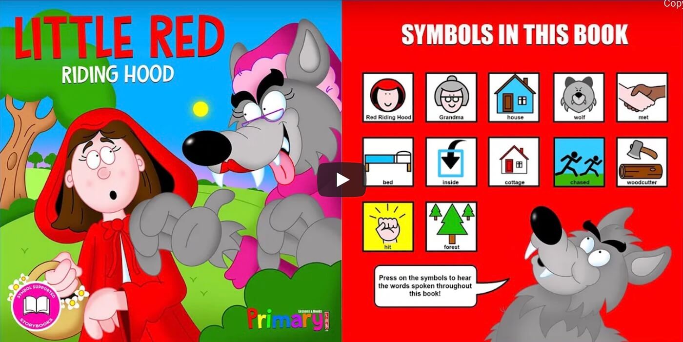
- Use visual aids to reinforce information in the text (but make sure to include an accessibility descriptions as noted later in this post).
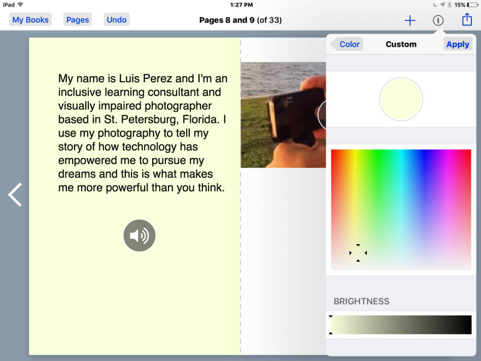
- Use an off-white background. For some readers, an overly bright (all white) background can result in significant visual stress. To reduce this stress, you can choose a more dim background color in Book Creator. With no item on the page selected, tap the Inspector (i) button and choose a page under Background, then tap More under Color. A color toward the bottom of the color picker should work well.
2. Add descriptions to images
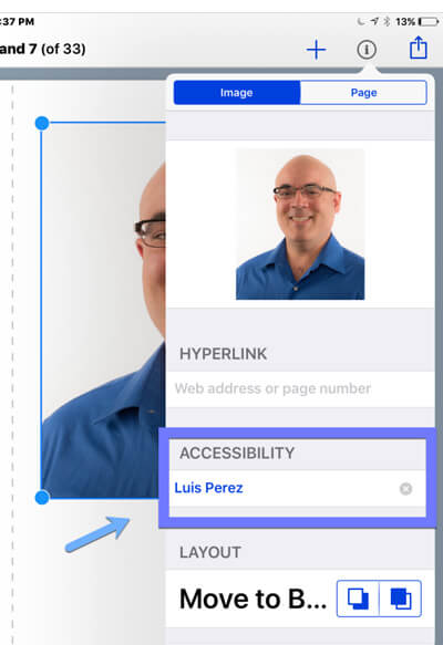 Readers who are blind will rely on assistive technology (screen readers) to access the content in your books. Screen readers are only able to describe images to readers who are blind when they include a text alternative. Adding a text alternative is straightforward in Book Creator:
- With the image selected, tap the Inspector (i) button in the toolbar.
- Tap in the Accessibility field.
- Enter text that describes what the image represents rather than its appearance. WebAIM has an excellent article on how to create more effective alternative text for images.
The video below shows you how to add accessibility descriptions (alternative text) to images in Book Creator.
3. Create descriptive links
Some of your readers will be listening to the content because they are not able to see the display. They will be using a screen reader (VoiceOver on the iPad) to hear the text read aloud. When the screen reader comes across a link that reads as “click here” or “learn more” the person listening to the content will not have sufficient information to determine if the link is worth following or not.
Instead of using “click here” or “learn more” as the link text, select a descriptive phrase (e.g. “Learn more about adding accessibility descriptions”) and make that the link text – as with the following example:
How to add a hyperlink in Book Creator
4. Supplement text with audio
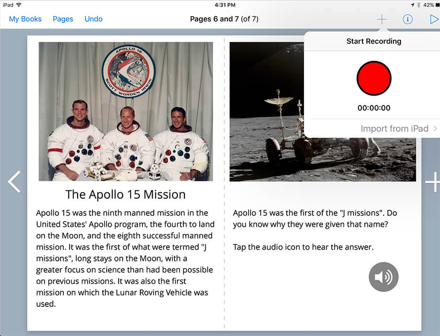
While the iPad has built-in text to speech features (Speak Selection and Speak Screen) and the quality of the voice continues to improve, some readers will still prefer to hear an actual human voice reading the text. Fortunately, adding a recording of the text is an easy task in Book Creator:
- Tap the Add (+) button in the toolbar.
- Choose Add Sound.
- Tap the Start Recording button (the red disk).
- Read the text and tap the Stop Recording button when finished.
- Tap Yes to use the recording.
- Move the Speaker icon to the desired location on the page (it should be right below the corresponding text).
5. Remember, bits are free!
The only limitation to the length of your book is the amount of storage on your device. Feel free to spread it out! Too much content on a single page can be overwhelming for some readers. A better approach is to use white space to present a clean layout with information organized into easy to digest chunks. This may require you to create more pages, but that’s ok – remember bits are free!
Luis Perez is an Apple Distinguished Educator, mobile learning and accessibility advocate, and author of ‘Mobile Learning for All’.
Luis is an Inclusive Learning Consultant and visually impaired photographer. He’s also a keen user of Book Creator (he was one of the first Book Creator Ambassadors) and he uses photography to tell the story of how technology has empowered him.




4 Comments on “5 easy accessibility tips for Book Creator authors”
This is great. We have kids who are good story tellers.
I use the book creator app frequently and it’s a great app for making books but a problem I have is like spaces. Is there any way to control line spacing. One page will be single spaces and the next will randomly be double spaced and I don’t know why or how to fix so they are the same.
Hi Cindy – we haven’t added line spacing yet but it is a known feature request, thanks for letting us know.
I have the same issue as Cindy – sometimes the lines in a text box will be double spaced, instead of single spaced, for no apparent reason. It would be great if you could fix this bug.